Neil Packer, on illustrating Harry Potter
 Neil produced many of the illustrations for Harry Potter and the Order of the Phoenix to assist Jim Kay with this enormous book. You can see a handful of them in the illustration section – and Neil was subsequently asked by the French media site ‘UniversHarryPotter.com’ to describe how it happened, so we’ve decided to include his answers here.
Could you explain how you came to work with Jim Kay? Was it the publisher or the illustrator who approached you with the proposal?
Jim is a friend of mine. We’ve known each other for a while and we were fans of each other’s work long before we met. It was probably obvious to both Jim and the publishers from a very early stage that there was an insane amount of work to do for this book because of the size of it. Jim had already set the bar extraordinarily high in terms of the quality and the number of illustrations he had made for the previous books, so he was keen to get someone else involved to share the workload, simply in order to get the book finished within a reasonable amount of time.
I believe that it was Jim who suggested to Bloomsbury (The UK Publishers) that I might be involved as he felt he could trust me and we knew that we could work together well. He also felt that our work was different enough that it was not in conflict with each other and if I worked on some of the marginalia it would then free up time for Jim to focus more on the characters and the central storyline.
It was probably a good nine months between proposing the idea and any contracts being signed and I spent a lot of that time developing test illustrations to try and establish how a collaboration might work. We knew that getting approval from the UK publishers, as well as all of the many co edition publishers and ultimately J K Rowling would take some time, but I think Jim felt that a collaboration was the only option. It was important for all of us that my work complimented Jim’s but in no way interfered with it, as his extraordinary talent for realising the characters and the world they inhabit has characterised the whole series.

Before taking part in this collaboration, did you already know the Harry Potter saga? Which other books) would you have liked to work on?
Yes of course, it was impossible to ignore as a publishing phenomenon when they first came out, and later I read them with my child before he was old enough to read them himself.
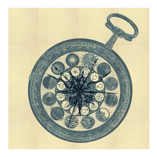
There are huge amounts of illustrative riches to be found in all of the books but considering my role within this project in all honesty I think that “illustratively” Order of the Phoenix is possibly the best. I got to illustrate the cutaway of the Ministry of Magic in a slightly faux Edwardian style rather like an old-fashioned plan of a department store, and I also got to imagine the Black family tree tapestry in a faux medieval style. I used a Victorian style for the interior for St Mungo’s and a fantasy Elizabethan Hogsmeade, all the sort of styles, periods and details that I love working on and are very much within my comfort zone.
How did you and Jim Kay divide up the different illustrations that make up this book?
Interestingly that is not something for the most part that I got to decide. It’s almost entirely the decision of the designer in collaboration with the editor at Bloomsbury although very occasionally one of us might suggest that we would particularly like to do a certain image. A lot of the book had already been designed by the time I came on board and Jim was at least half way through the illustrations.
The challenge for all of us with this book was its size, at 566 pages for a book with these dimensions it is at the limit of what is reasonable in terms of weight. If it was any bigger it wouldn’t hold itself together, so adding more pages is not an option. Quite rightly Jim was allotted most of the spreads available to carry the story and illustrate characters old and new as only he can. A lot of my role involved trying to make illustrations work as borders, (Firenze’s Divination classroom is a good example) in order to save space and yet still bring something visually interesting to a spread.
That is why making a book like this is a true collaboration, there is a surprisingly small team at Bloomsbury who put the illustrated edition together and their roles are equally important as mine and Jim’s. That they got this enormous book to work, to be coherent and look beautiful is a small miracle.

Did you feel any apprehension to take part in this book, considering the patience of the fans who had to wait for 3 years after the release of volume 4 ?
Yes absolutely. You always worry about how people are going to react to your work but even more so for this book given what it is and the love and respect in which both the story and Jim is held by the fans.
Yes. Three years is a long time to wait but I know how insanely hard I had to work on this book, and Jim would have been doing exactly the same for the two years before I was involved, and for the seven years prior to that for all the previous books. I am not complaining: I love what I do and it is a privilege to be able to do something I love for a living and to work on a project like this but illustrating a book of this size for one person, and even ultimately for two is not easy and does take time. Just to give some sense of how much time, The Ministry of Magic spread which, to be fair, was the most complicated piece I worked on, took nearly two months. That was nearly one sixth of my time budget gone on a single spread.
How would you define your style, your approach for this book? What techniques did you use? Your references and sources of inspiration?
My approach to illustrating any book is always to serve the text. The illustrations need to emphasise, reflect or explain what is happening within a storyline or sometimes reinforce a subtext or occasionally point outside of the story to something else that may be relevant. The choice of what exactly to show might be made by the illustrator but is often a decision made by the art director and the editor.
Stylistically my inspiration from this book came from many sources. Most importantly my work had to sit comfortably alongside Jim’s work but not look like it. Jim and myself share many of the same interests and reference sources, we are both influenced by Medieval art and in particular the Herbals and Bestiaries (early books about the natural world and fantastical creatures). We share a passion for architecture and typography ,and all these things help to create a coherence.
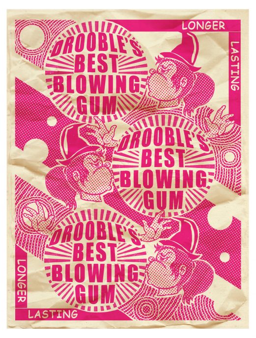
Because I was not illustrating the core narrative of this book I could afford to shift my style slightly depending on what was being depicted, so for instance I heavily drew on Medieval tapestries when working on the Black family tree. I drew on sources of Edwardian architecture and advertising material for the Ministry. Sometimes I might push my style towards traditional woodblock printing and on one occasion a 1970’s style bubble gum wrapper but always taking my cue from the text and what Jim has done.

When working on a book what are the first steps you take?
Read it, then read it again and then again.
This project was different from many books I have worked on in recent years where I might have a lot of freedom to choose what to illustrate and to plan an overview myself. I came to The Order of the Phoenix two years into the project and pretty much all the planning was already in place which actually was a relief and I was very happy to be told exactly what required illustrating without having to make those decisions myself.
Was it necessary for you to go back, observe and based on Kay’s work in this book but especially in the previous books of the saga in order to have a complementarity on the whole and to avoid in a way a marked denaturation?
As I have mentioned previously it was very important to complement Jim’s work and to understand exactly what he was planning. Interestingly, Jim shifts his style in this book too in order to complement the style of the writing which becomes darker as themes develop. The characters are growing up by book five, and the normal anxieties of teenage years as well as the overwhelming sense that something monumental is approaching builds towards the end of this book – and Jim’s art reflects this beautifully. There is a loss of innocence and it is absolutely essential that the style of illustration reflects this. It is all about creating moods like switching keys in music to create tension or staccato editing in film-making to create excitement. The choice of what to illustrate and how to render it can do the job of a good soundtrack.
Did you need to read this fifth volume as a whole? The others? If yes, how much did reading the fifth volume influence how you approached your illustrations. If not, how did you proceed?
Yes. I did read it and more than once, I actually had Covid at the time and was confined to bed so frankly I was glad of something to pass the time. It was also a useful way of getting some work done whilst I was unable to do any drawing. I had no idea at the time what I was going to be asked to do for the book, (this was before I was given the green light to work on it). It was a few years since I had read it so I really needed to get up to speed but even if you are only working on parts of a book it is important to know the story in detail to gain an idea of context.
Of all the illustrations you made for this book, which one(s) do you like the most? And why?
Undoubtedly the Ministry of Magic. It wasn’t originally planned as anything as detailed as it eventually became, and it was going to be horizontal and split over the two spreads. At some point we decided to orientate it sideways because it would work better as an image. There was a delay in getting the artwork briefs for the set of images that were to follow M of M so I found myself unusually with the luxury of a bit of time to work on this spread. The production team saw the possibility of making something special and kept sending me more and more information about the Ministry and its workings. In the end I think we managed to reference just about every mention of it in the entire series.
It was roughly two months’ work on this illustration and pretty long days too, but when a piece is going well and you are in the right frame of mind and are enjoying it, which I was with this drawing, then the time passes very quickly. However if you are not in a good place and not happy with what you are doing it can be an awful struggle.
It is probably very premature for this answer, but following Jim Kay’s departure / retirement, could you pick up the torch?
In a word, No! Firstly I am not a character illustrator and there are very few people who can do it as well as Jim, although he brings so much more to these books besides the characters. He has a deep understanding of the natural world, of science and a knowledge of Medieval art, architecture and his sheer ability as an artist and visual storyteller all feed into these books. He is going to be an incredibly hard act to follow as his style and imagination are so much a part of what is most loved about these books. That is however not to say that there aren’t illustrators who could do it although it would be unfair to name any but I am not among them as my strengths as an artist lie elsewhere However I do have complete faith in the team at Bloomsbury that they will make the best choice for this editions’ future.